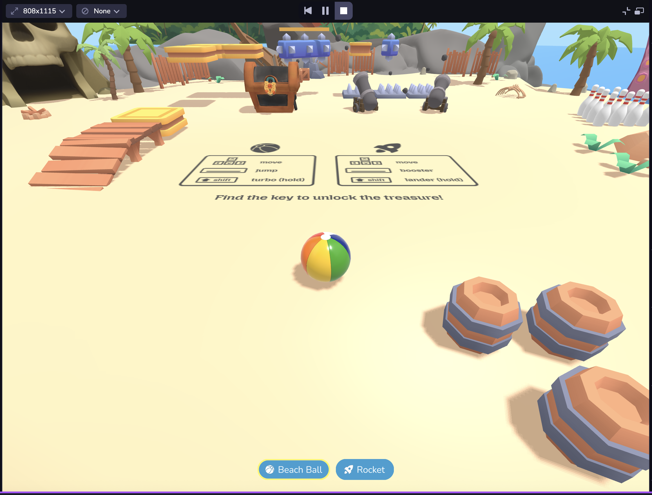
Simulator
Launch the simulator to play your scene. You can make edits to the entities in your space and see those immediately reflected in the simulator. The simulator also lets you test and view project changes across different device viewport sizes without needing to leave Studio.
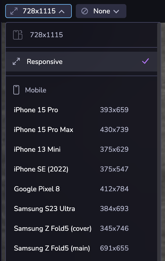
Your project might look different on different devices due to differences in the mobile web viewport size. Or you may want to see your project in both landscape and portrait mode. At the top left of the Simulator, you can choose from a set of common device viewport sizes, change the orientation, or use responsive mode to adjust to a custom size.
Dimensions are presented in CSS logical pixels (AKA viewport dimensions), not physical device pixels. When selecting a device from the selector, only the viewport dimensions will be updated, not the user agent of the client.